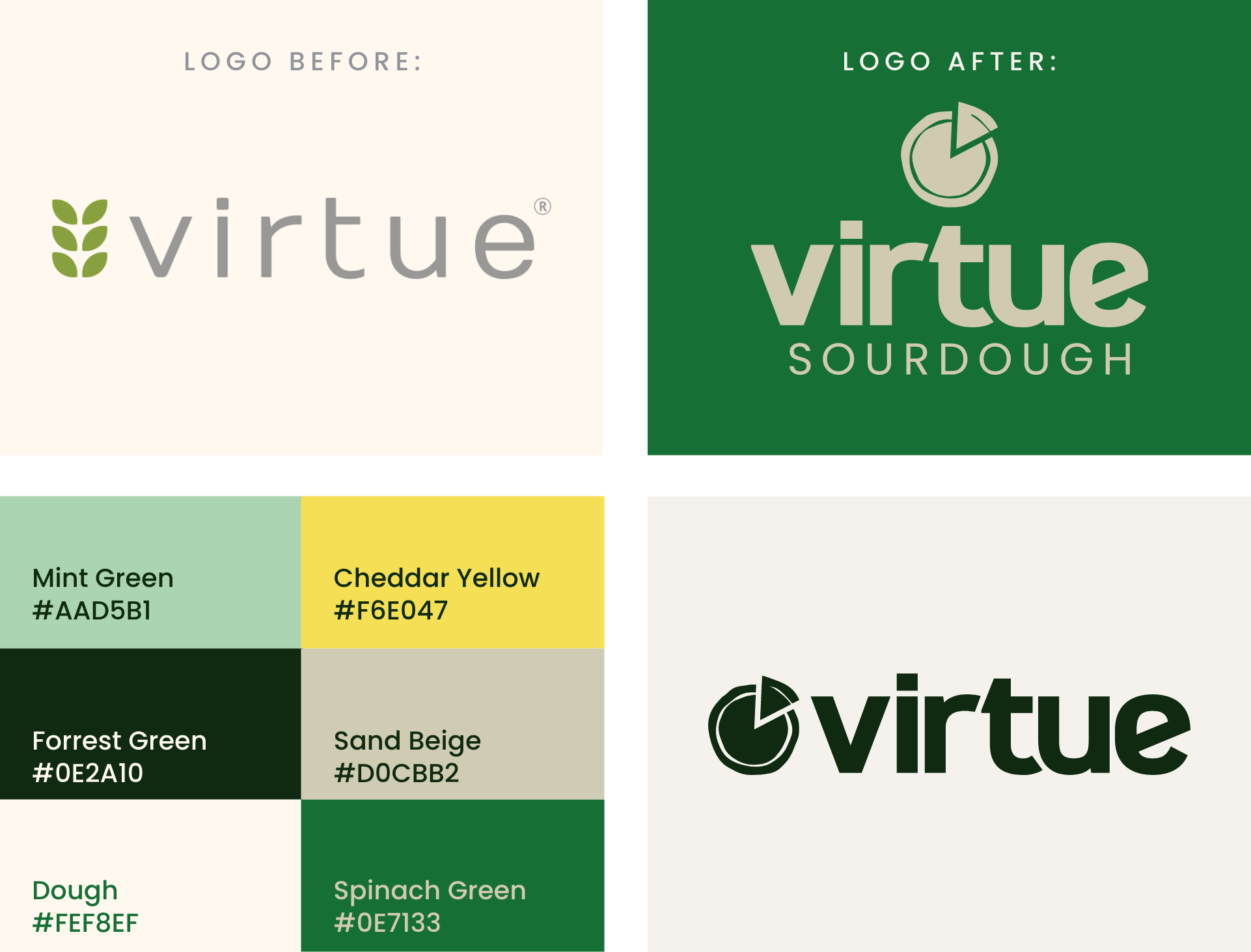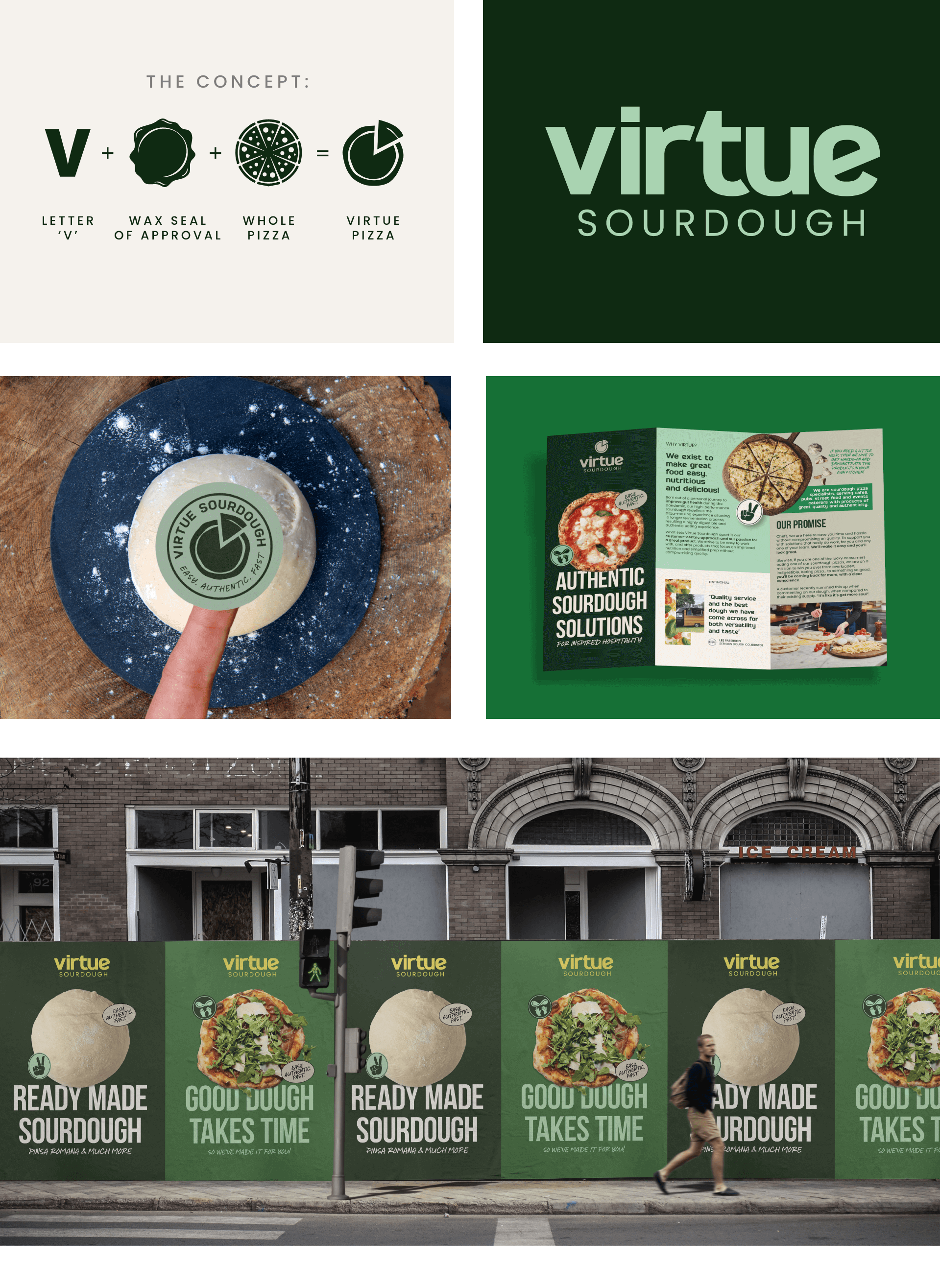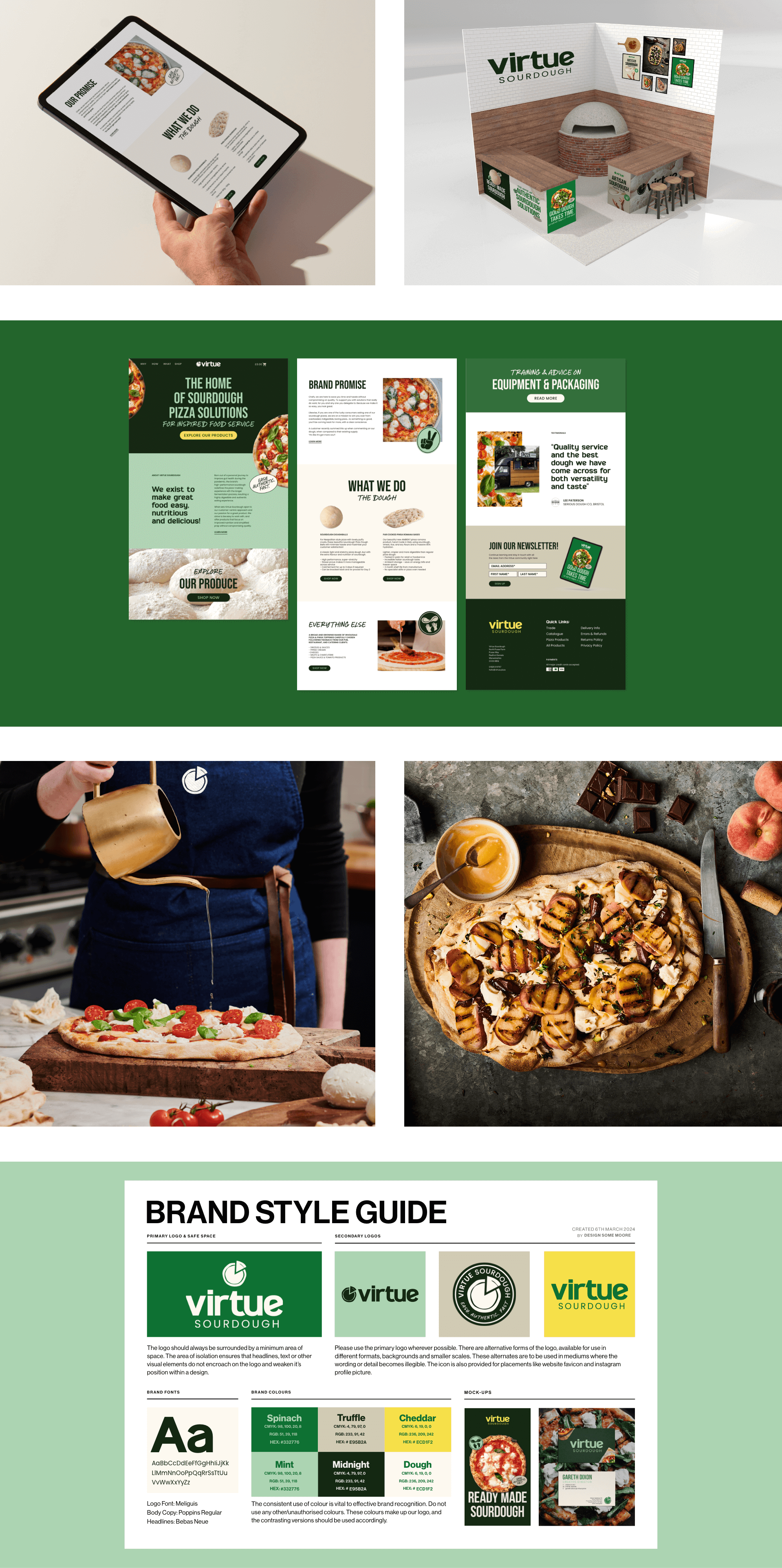

The concept for the Virtue Sourdough logo was inspired by the idea of combining elements that symbolise authenticity and the essence of sourdough pizza.
The use of a wax seal shape serves as a nod to authenticity and craftsmanship. Within the wax seal shape, the design incorporates a subtle visual representation of a pizza being pulled apart, with a distinct ‘V’ shape slice being lifted, also representing the initial letter of “Virtue”.


Vickie has been great to work with, enthusiatic, responsive & creative in translating what was in our heads to the new branding. We are super happy with the final results and would not hesitate to recommend.
Branding is a way of identifying your business. It is how your customers recognise your company. At Design Some Moore, we promise to make the design journey as stress free and enjoyable as possible.
Work together